

A tarot card carries meaning in three layers: the figure on it (a Magician, a Tower), the symbols arranged around the figure (planetary glyphs, suit signs, numerical position), and the visual language of the deck itself — its colour palette, frame style, and recurring motifs that bind the seventy-eight cards into a single voice. Most readers never analyse the third layer consciously, yet it is what makes a deck feel coherent. Below is a short guide to the recurring motifs that show up across a card-back tradition stretching from the Visconti-Sforza decks of fifteenth-century Milan to contemporary independent illustrators.
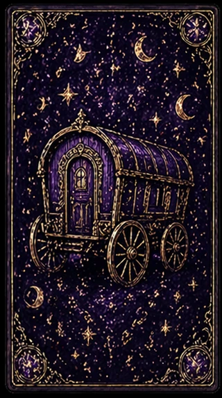
The Caravan / The Wandering. The horse-drawn caravan or wagon, set against a star-field, is one of the deck’s quiet inheritances from Romani folk-divination. It signals movement that is not goal-directed — the journey as inhabited place, not transit. When this image is foregrounded on a card-back, the deck is announcing itself as belonging to a divinatory rather than a gaming lineage. Modern decks often replace the caravan with a stylised gypsy wagon or a starlit road; the meaning is consistent.
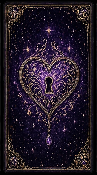
The Heart-Keyhole. A heart shape with a keyhole at its centre — usually rendered in gold filigree against a dark ground — is shorthand for the locked feeling. The motif descends from medieval European emblem-books, where the human heart was drawn as a vessel that could be locked, opened, broken, or sealed. On a tarot card-back, the heart-keyhole image declares that this deck reads emotional life rather than tactical advice. Decks foregrounding this motif tend toward the introspective Marseille rather than the prescriptive Rider-Waite lineage.
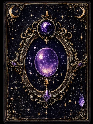
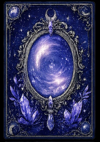
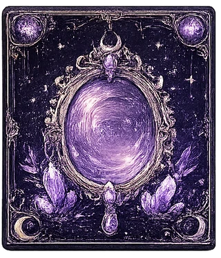
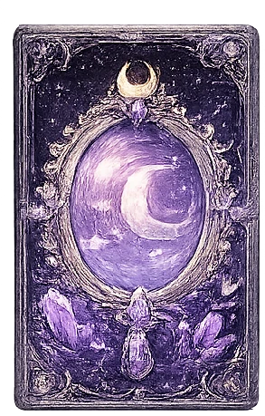
The Ovular Mirror. A vertically-oriented oval, framed by celestial elements (moons, crystals, suspended pendants), is the visual signature of the scrying tradition. Oval rather than round because the elongated shape mimics the shape of an actual hand-mirror. When a card-back uses this composition, the deck is positioning itself as a scrying tool — meaning the diviner is meant to look into the cards, not just at them. Often the eye in the centre of the oval is missing on purpose; the diviner’s own gaze fills it.
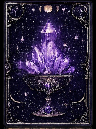
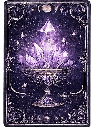
The Chalice and the Crystal. The cup as receptacle, with crystals or flowers rising from it, is the suit-of-cups symbol expanded into the deck’s overall iconography. Reading: this deck holds emotion rather than dispensing it. The chalice is often empty in classical tarot; modern decks fill it with growing crystals to suggest that emotion has structure. Readers who prefer this iconography tend to ask emotional questions of the cards rather than predictive ones.
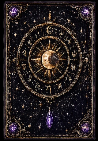
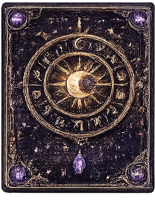
The Sun-Moon Axis. Sun and moon together — usually as a dial or layered disc — is the deck’s astrological signature. The presence of zodiac glyphs around the dial declares that this deck is built for time-coded reading: questions about when rather than just whether. Originally a Hermetic device (Marsilio Ficino’s De Vita Coelitus Comparanda gives the planetary correspondences); the Golden Dawn formalised the assignment of planets and zodiac signs to specific tarot cards in the late nineteenth century.
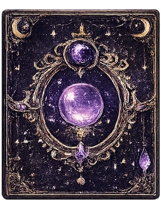
The Mirror Round. Round mirror — often surrounded by botanical or crystal elements — repeats the scrying motif but with a different spin: the round mirror is the moon-mirror, used in lunar divination practices that pre-date tarot. Card-backs that feature the round mirror prominently usually belong to lunar-coded decks, designed to be read at the new and full moon rather than daily.
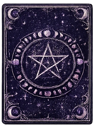
The Pentagram and the Lunar Cycle. A pentagram set inside a circle of moon phases is the deck’s protection-and-cycle signature. The five points of the pentagram correspond to the four elements plus spirit; the lunar cycle around it situates the deck in time. Decks using this composition often have a Wiccan or modern-witchcraft framing rather than a strict Hermetic one. The texturing — these cards often look “worn” — is intentional, signalling intimate use rather than display.
The Crystal-Bordered Mirror. Variation of the ovular mirror with crystal elements around the frame. Crystals here function as anchors — they keep the scrying gaze from drifting too far. This composition is common on decks designed for new readers; the crystals are visual handholds.
The Cross-Tradition Disc. A solar-lunar disc with non-Latin glyphs (runes, Hebrew, Coptic-style) signals a deck that wants to root itself in pre-Christian sources. The textured “antique” finish is part of the message: the deck is presenting itself as old. Whether the runes are accurate Elder Futhark or decorative is a different question; some independent decks are rigorous, others are evocative.
The Repeating Chalice. When a deck uses the chalice motif twice (or more) on its card-backs, it is signalling that the suit of cups is the dominant frame — that all reading flows through the heart. Less common in traditional decks; more common in contemporary independent decks designed by women illustrators in the 2010s-2020s. The repetition is intentional.
The Crystal Sphere. Pure scrying iconography — a single crystal sphere, suspended in an ornate frame, with no figure inside it. The sphere is held as occasion: the diviner is invited to project. Decks foregrounding the bare sphere tend to be deliberately minimal, trusting the reader to bring meaning rather than decoding pre-printed symbols. This is the most “open” of the card-back compositions.
The Crescent Egg. A crystal egg containing a crescent moon, often resting on a lotus or floral base, is the deck’s fertility-and-renewal signature. The egg shape recurs across world divinatory traditions — Egyptian funerary art, Slavic Pysanky, Hindu cosmology. On tarot, it announces that this deck reads cycles of beginning rather than fixed states. Best used at the new moon and at the start of personal projects.
A note on the colour palette of this lineage: deep purples and indigos signal the night-mind — the part of consciousness that the deck is asking the reader to consult. Gold filigree edges represent the divine ordering of the chaos shown inside; without the gold frame, the imagery would feel boundless. The contrast is intentional and old. When a deck breaks with the purple-and-gold convention (using earthy reds, or pure white grounds), it is making a statement about the kind of reading it offers — louder, faster, less contemplative. Most readers eventually own at least two decks for this reason: one for night-questions, one for day-questions.